


Some of the major Pros of Matplotlib are:
- Generally easy to get started for simple plots
- Support for custom labels and texts
- Great control of every element in a figure
- High-quality output in many formats
- Very customizable in general
Installation
conda install matplotlib
# or pip install matplotlib
Importing
import matplotlib.pyplot as plt
%matplotlib inline
plt.show()
Example
import numpy as np
x = np.linspace(0, 5, 11)
y = x ** 2
'''
x : array([ 0. ,  0.5,  1. ,  1.5,  2. ,  2.5,  3. ,  3.5,  4. ,  4.5,  5. ])
y : array([  0.  ,   0.25,   1.  ,   2.25,   4.  ,   6.25,   9.  ,  12.25,
        16.  ,  20.25,  25.  ])
'''
Basic Matplotlib Commands
plt.plot(x, y, 'r') # 'r' is the color red
plt.xlabel('X Axis Title Here')
plt.ylabel('Y Axis Title Here')
plt.title('String Title Here')
plt.show()
Creating Multiplots on Same Canvas
# plt.subplot(nrows, ncols, plot_number)
plt.subplot(1,2,1)
plt.plot(x, y, 'r--') # More on color options later
plt.subplot(1,2,2)
plt.plot(y, x, 'g*-');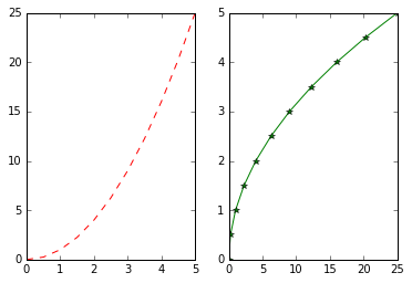
Matplotlib Object Oriented Method
# Create Figure (empty canvas)
# 빈 캔버스 생성
fig = plt.figure()

# Add set of axes to figure
# 축 설정
axes = fig.add_axes([0.1, 0.1, 0.8, 0.8]) # left, bottom, width, height (range 0 to 1)

# Plot on that set of axes
axes.plot(x, y, 'b')
axes.set_xlabel('Set X Label') # Notice the use of set_ to begin methods
axes.set_ylabel('Set y Label')
axes.set_title('Set Title')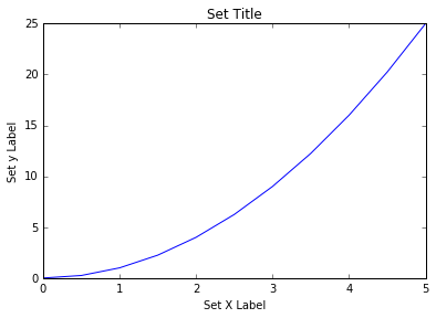
# Creates blank canvas
fig = plt.figure()

axes1 = fig.add_axes([0.1, 0.1, 0.8, 0.8]) # main axes
axes2 = fig.add_axes([0.2, 0.5, 0.4, 0.3]) # inset axes

# Larger Figure Axes 1
axes1.plot(x, y, 'b')
axes1.set_xlabel('X_label_axes2')
axes1.set_ylabel('Y_label_axes2')
axes1.set_title('Axes 2 Title')

# Insert Figure Axes 2
axes2.plot(y, x, 'r')
axes2.set_xlabel('X_label_axes2')
axes2.set_ylabel('Y_label_axes2')
axes2.set_title('Axes 2 Title');
subplots()
# Use similar to plt.figure() except use tuple unpacking to grab fig and axes
fig, axes = plt.subplots()

# Now use the axes object to add stuff to plot
axes.plot(x, y, 'r')
axes.set_xlabel('x')
axes.set_ylabel('y')
axes.set_title('title');
Then you can specify the number of rows and columns when creating the subplots() object:
# Empty canvas of 1 by 2 subplots
fig, axes = plt.subplots(nrows=1, ncols=2)

for ax in axes:
    ax.plot(x, y, 'b')
    ax.set_xlabel('x')
    ax.set_ylabel('y')
    ax.set_title('title')


fig  # Display the figure object
plt.tight_layout()   # 축 위치를 알맞게 조정한다.
fig.tight_layout() or plt.tight_layout() 사용하여 위치 조정


Figure size, aspect ratio and DPI
fig = plt.figure(figsize=(8,4), dpi=100) #사이즈와 dpi조정
Saving figures
fig.savefig("filename.png", dpi=200) # dpi는 생략 가능하다
Legends, labels and titles
fig = plt.figure()

ax = fig.add_axes([0,0,1,1])

ax.plot(x, x**2, label="x**2")
ax.plot(x, x**3, label="x**3")
ax.legend()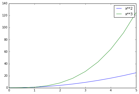
legend 위치 설정
# Lots of options....

ax.legend(loc=1) # 오른쪽 위
ax.legend(loc=2) # 왼쪽 위
ax.legend(loc=3) # 왼쪽 아래
ax.legend(loc=4) # 오른쪽 아래

# .. many more options are available

# Most common to choose
ax.legend(loc=0) # let matplotlib decide the optimal location
fig
Setting colors, linewidths, linetypes
MatLab 스타일
# MATLAB style line color and style
fig, ax = plt.subplots()
ax.plot(x, x**2, 'b.-') # blue line with dots
ax.plot(x, x**3, 'g--') # green dashed line
Colors with the color= parameter
fig, ax = plt.subplots()

ax.plot(x, x+1, color="blue", alpha=0.5) # half-transparant
ax.plot(x, x+2, color="#8B008B")        # RGB hex code
ax.plot(x, x+3, color="#FF8C00") # RGB hex code 

Line and marker styles
fig, ax = plt.subplots(figsize=(12,6))

ax.plot(x, x+1, color="red", linewidth=0.25)
ax.plot(x, x+2, color="red", linewidth=0.50)
ax.plot(x, x+3, color="red", linewidth=1.00)
ax.plot(x, x+4, color="red", linewidth=2.00)

# possible linestype options ‘-‘, ‘–’, ‘-.’, ‘:’, ‘steps’
ax.plot(x, x+5, color="green", lw=3, linestyle='-')
ax.plot(x, x+6, color="green", lw=3, ls='-.')
ax.plot(x, x+7, color="green", lw=3, ls=':')

# custom dash
line, = ax.plot(x, x+8, color="black", lw=1.50)
line.set_dashes([5, 10, 15, 10]) # format: line length, space length, ...

# possible marker symbols: marker = '+', 'o', '*', 's', ',', '.', '1', '2', '3', '4', ...
ax.plot(x, x+ 9, color="blue", lw=3, ls='-', marker='+')
ax.plot(x, x+10, color="blue", lw=3, ls='--', marker='o')
ax.plot(x, x+11, color="blue", lw=3, ls='-', marker='s')
ax.plot(x, x+12, color="blue", lw=3, ls='--', marker='1')

# marker size and color
ax.plot(x, x+13, color="purple", lw=1, ls='-', marker='o', markersize=2)
ax.plot(x, x+14, color="purple", lw=1, ls='-', marker='o', markersize=4)
ax.plot(x, x+15, color="purple", lw=1, ls='-', marker='o', markersize=8, markerfacecolor="red")
ax.plot(x, x+16, color="purple", lw=1, ls='-', marker='s', markersize=8,
        markerfacecolor="yellow", markeredgewidth=3, markeredgecolor="green");
Plot range
fig, axes = plt.subplots(1, 3, figsize=(12, 4))

axes[0].plot(x, x**2, x, x**3)
axes[0].set_title("default axes ranges")

axes[1].plot(x, x**2, x, x**3)
axes[1].axis('tight')
axes[1].set_title("tight axes")

axes[2].plot(x, x**2, x, x**3)
axes[2].set_ylim([0, 60])
axes[2].set_xlim([2, 5])
axes[2].set_title("custom axes range")
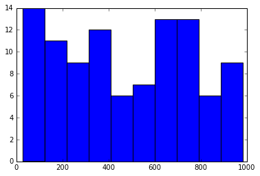
Special Plot Types : scatter, bar
#--- scatter ------
plt.scatter(x,y)

#--- bar ------------------------
from random import sample
data = sample(range(1, 1000), 100)
plt.hist(data)

#--- box plot ---------------------------------------------------
data = [np.random.normal(0, std, 100) for std in range(1, 4)]

# rectangular box plot
plt.boxplot(data,vert=True,patch_artist=True); 

---good!
'Python > Numpy & Pandas' 카테고리의 다른 글
| Pandas Built-in Data Visualization (0) | 2020.12.03 |
|---|---|
| Advanced Matplotlib Concepts (0) | 2020.12.02 |
| --- (0) | 2020.12.02 |
| 07-Data Input and Output (0) | 2020.12.01 |
| 06-Operations (0) | 2020.12.01 |
hjc_
୧( “̮ )୨